The first time I looked at a stock chart with any intention of understanding it, I was staring at Tesla’s daily chart in early 2020. Green and red rectangles, thin lines poking out of them, a mountain range of bars along the bottom, and several squiggly lines weaving through the whole mess. It looked like a foreign language, which, to be fair, it kind of is. But it’s a learnable one. And once a few concepts click, you’ll start seeing information in those charts that a simple stock price quote can’t give you.
Stock charts are visual records of what buyers and sellers have done over time. That’s all they are. Every candle, every bar, every line represents real transactions between real people (and increasingly, real algorithms) making real decisions with real money. Learning to read them won’t make you a Wall Street wizard. But it will help you understand what’s happening with a stock beyond the current price, and that alone is worth the effort.
What the Axes Tell You
Start with the basics. A stock chart has two axes.
The vertical axis (y-axis) shows price. On most platforms, this runs from bottom (lower prices) to top (higher prices). The scale can be linear or logarithmic. Linear scale means each dollar increment gets the same amount of space. A move from $10 to $20 looks the same as a move from $100 to $110. Logarithmic scale adjusts so that percentage moves get equal space: a 100% gain from $10 to $20 takes up the same vertical distance as a 100% gain from $50 to $100. For long-term charts spanning years, logarithmic is almost always more useful. For short-term trading charts, linear works fine.
The horizontal axis (x-axis) shows time. This can be anything from one-minute intervals for day traders to monthly candles for long-term investors. The time frame you choose changes everything about what the chart tells you. Apple’s 5-minute chart might look terrifying on a volatile Tuesday while its weekly chart shows a calm, steady uptrend. Same stock, completely different story depending on the lens.
The SEC’s introduction to investing covers the fundamentals of stock ownership, which is useful context before you start analyzing price movements.
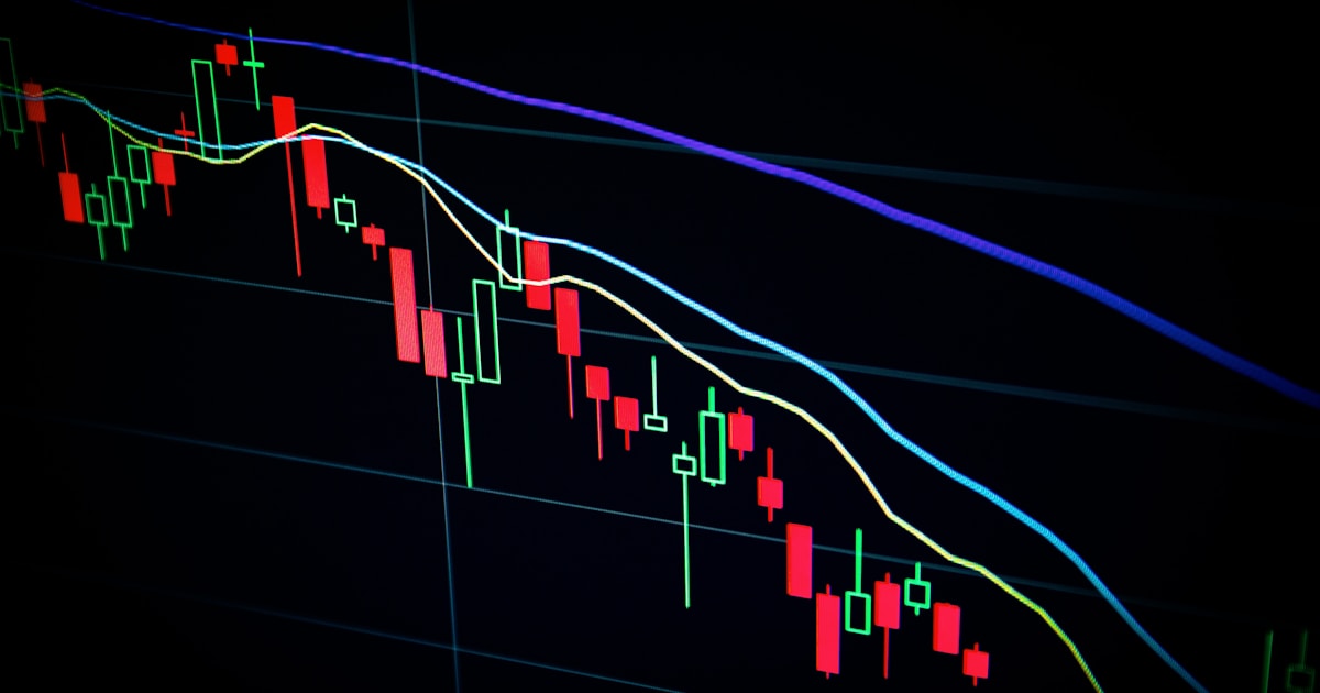
Candlestick Charts: The Standard
Most stock charts use candlesticks, a charting method that originated with Japanese rice traders in the 1700s. A man named Munehisa Homma is credited with developing the technique, and his work predates Western charting by over a century.
Each candlestick represents one time period (one day, one hour, one week, whatever your chart is set to). It shows four pieces of information: the opening price, the closing price, the highest price during that period, and the lowest price.
The thick part of the candlestick is called the “body.” If the closing price is higher than the opening price (the stock went up during that period), the candle is typically colored green or white. If the closing price is lower than the opening price (the stock went down), it’s red or black.
The thin lines above and below the body are called “wicks” or “shadows.” The top of the upper wick is the highest price reached during the period. The bottom of the lower wick is the lowest price.
Here’s why this matters more than a simple line chart. A line chart connects closing prices and gives you the general direction. A candlestick chart gives you the battle. Take a day where a stock opens at $50, drops to $45, rallies to $53, and closes at $52. The line chart shows a $2 gain. The candlestick shows you the $8 range, the initial selloff, the strong recovery, and the close near the high. That’s dramatically different information.
Some candlestick shapes have names and are treated as signals. A “doji” has an opening and closing price that are nearly identical, creating a cross-shaped candle. It suggests indecision between buyers and sellers. A “hammer” has a small body near the top and a long lower wick, suggesting that sellers pushed the price down but buyers fought back and recovered most of the ground. A “shooting star” is the inverse: a small body near the bottom with a long upper wick, meaning buyers pushed higher but sellers overwhelmed them.
Don’t memorize 50 candlestick patterns. Most of them show up too rarely to matter. Focus on dojis, hammers, engulfing patterns (where one candle’s body completely covers the previous candle’s body), and the general size relationship between bodies and wicks. FINRA’s investor education resources provide a solid foundation for understanding how stock prices move.
Volume: The Missing Context
Below the price chart, you’ll usually see a row of vertical bars. That’s volume, the number of shares traded during each time period. Volume is the single most underappreciated element on a stock chart.
Price tells you what happened. Volume tells you how much conviction was behind it. A stock jumping 5% on 10 million shares traded is a fundamentally different event than the same stock jumping 5% on 500,000 shares. High volume means lots of participants agreed this was the right time to buy or sell. Low volume means the move happened on thin participation and might not stick.
Some patterns to watch for. Volume spikes on breakouts confirm the move. If a stock breaks above resistance (more on this shortly) on three times its average daily volume, that breakout has teeth. If it breaks out on below-average volume, be skeptical. Volume drying up during a pullback is actually bullish. It means sellers are losing interest, and the decline is running out of fuel.
The color of volume bars usually corresponds to whether the price closed up or down that period. Green volume bars on up days and red on down days is the default on most platforms.
Average daily volume matters too. A stock that typically trades 2 million shares a day is far more liquid than one that trades 50,000. Liquidity affects everything: the spread between bid and ask prices, your ability to get in and out of positions quickly, and the risk of slippage on larger orders. The SEC’s guidance on market structure explains how trading volume and liquidity interact.
Moving Averages: The Trend Smoothers
Moving averages are lines overlaid on the price chart that smooth out short-term noise and show the overall trend direction. They’re calculated by averaging the closing prices over a specific number of periods.
The two most commonly used: the 50-day moving average (50 MA) and the 200-day moving average (200 MA). The 50 MA shows the average closing price over the last 50 trading days. The 200 MA does the same over 200 days. On a chart, the 50 MA is the more reactive line (it turns faster), and the 200 MA is the slower, smoother one.
When the price is above both moving averages, the stock is generally considered to be in an uptrend. When it’s below both, it’s in a downtrend. When the 50 MA crosses above the 200 MA, traders call it a “golden cross” and treat it as a bullish signal. When the 50 MA crosses below the 200 MA, that’s a “death cross” and it’s bearish. These are the most widely watched moving average signals in the market.
Are they reliable? Mixed. The golden cross on the S&P 500 in July 2020 preceded a massive rally. The golden cross in early 2023 preceded another strong run. But golden crosses during choppy, sideways markets generate false signals. The death cross in March 2022 preceded a real decline, but the one in December 2018 hit right near the market bottom. These signals work best in trending markets and fail in range-bound ones.
You’ll also see exponential moving averages (EMAs), which weight recent prices more heavily than older ones. The 9-day and 21-day EMAs are popular for short-term traders. For longer-term analysis, the simple 50 and 200 MAs are standard.
Moving averages also act as dynamic support and resistance levels. In a strong uptrend, you’ll often see the price pull back to the 50 MA and bounce. In a downtrend, rallies frequently stall at the 50 or 200 MA. This doesn’t work every time, but it happens often enough that it’s worth watching.
Support and Resistance: Where Price Stalls
Support is a price level where a stock tends to stop falling and bounce. Resistance is a price level where it tends to stop rising and pull back. These aren’t magic numbers. They’re zones where buyer and seller psychology concentrates.
If a stock bounces off $45 three times over six months, $45 is a support level. Lots of buyers step in at that price. Maybe institutional investors have standing orders there. Maybe retail traders see $45 as “cheap” and pile in. Whatever the reason, that level holds.
Resistance works the same way in reverse. If a stock keeps failing to break above $60, there are sellers concentrated at that level. Maybe it’s a round number, maybe it’s a previous high, maybe it’s where a bunch of investors who bought at $60 want to get out at breakeven.
The most important concept about support and resistance: when support breaks, it often becomes resistance. And when resistance breaks, it often becomes support. A stock that spent months bouncing off $45 suddenly drops to $40. If it rallies back to $45, that old support level now acts as resistance because all the people who bought at $45 and watched it fall to $40 want to sell at breakeven and get out.
Round numbers ($50, $100, $200) frequently act as psychological support and resistance levels. Amazon trading around $200 in 2025 saw visible reactions every time it approached that round number. It’s not rational, but markets are made of humans (and algorithms programmed by humans), and round numbers anchor decisions.
Drawing support and resistance lines is simple on any charting platform. Look for areas where the price has reversed multiple times. The more touches at a level, the more significant it is. Two touches is a level. Three or more touches is a strong level. FINRA’s guide to understanding your brokerage statements includes context on how to evaluate your positions, which pairs well with chart analysis.
Common Chart Patterns Beginners Should Know
I’m going to keep this to four patterns. There are hundreds cataloged in technical analysis textbooks, and most of them are exercises in seeing what you want to see. These four show up frequently, are visually distinct, and have a reasonable track record.
Head and Shoulders. Three peaks where the middle peak (the “head”) is the highest and the two outer peaks (the “shoulders”) are roughly equal height. A line connecting the lows between the peaks is the “neckline.” When the price breaks below the neckline after forming the right shoulder, it’s a bearish signal. The implied price target is the distance from the head to the neckline, projected downward from the breakout. Inverse head and shoulders is the mirror image and signals a bullish reversal.
This pattern played out clearly on Netflix’s chart in late 2021 into early 2022. The head formed around $700, the neckline broke around $560, and the stock eventually fell to below $180. Not every head and shoulders is that dramatic, but the structure was textbook.
Double Top / Double Bottom. Two peaks at roughly the same price level (double top, bearish) or two troughs at roughly the same level (double bottom, bullish). The pattern confirms when the price breaks the support level between the two tops or the resistance level between the two bottoms. A double bottom at $30 followed by a break above $35 (the peak between the two bottoms) is a buy signal for many traders.
Ascending Triangle. A series of higher lows converging toward a flat resistance level. It looks like a right triangle with the flat side on top. The higher lows show increasing buying pressure, and the flat resistance shows a ceiling that buyers are slowly chipping away at. When the price breaks above that flat resistance on strong volume, it tends to run. The SEC’s bulletin on online trading doesn’t cover chart patterns specifically but provides useful context on the risks of short-term trading based on technical signals.
Flag/Pennant. After a strong move up (or down), the price consolidates in a tight, slightly downward-sloping channel (flag) or a small symmetrical triangle (pennant). The prior move is the “flagpole.” The expectation is that the consolidation is a pause in the trend, and the price will continue in the original direction. These patterns typically resolve within a few weeks. Flags after a strong upward move that break higher on volume are among the most reliable continuation patterns in equity trading.
Putting It All Together
A chart tells you a story, but only if you read the elements in combination, not isolation.
Price making higher highs and higher lows while volume confirms each advance? That’s a healthy uptrend. Price hitting resistance on declining volume while the 50 MA flattens out? The trend is weakening. A stock breaks below its 200 MA on the highest volume in three months, and that former moving average support now acts as resistance on the first bounce attempt? That’s a trend change, not a dip to buy.
I’d suggest starting with one stock you know well. Pull up a daily chart with candlesticks, the 50 and 200 moving averages, and volume bars. Watch it for a few weeks. See how it reacts to those moving averages. Notice where support and resistance levels form. Watch what volume does at those key levels. You’ll learn more from watching one chart closely for a month than from reading five books on technical analysis.
And keep this in mind: charts show you what has happened and sometimes suggest what might happen. They don’t predict the future. A perfect cup-and-handle pattern means nothing if the company reports terrible earnings the next morning. Technical analysis is one tool. It works best when combined with fundamental analysis (the actual financial health of the company) and an honest assessment of the broader market environment.
The SEC’s investor.gov resources provide a useful overview of research tools available to individual investors, including both fundamental and technical approaches.
What's the best time frame for a stock chart if I'm a long-term investor?
Weekly or monthly charts. Daily charts create too much noise for someone with a multi-year holding period. A weekly chart shows you the larger trend, key support and resistance levels, and whether a stock is in a long-term uptrend or downtrend. Monthly charts are useful for looking at 5- to 10-year patterns. If you’re investing, not trading, you don’t need to watch daily candles.
Are stock chart patterns actually reliable?
Some patterns have statistical validity, but none are guaranteed. Academic research on the effectiveness of chart patterns is mixed. Thomas Bulkowski’s “Encyclopedia of Chart Patterns” tested dozens of patterns and found that most work better than a coin flip but far from perfectly. The key is confirmation: a pattern is stronger when supported by volume, moving average alignment, and broader market context. Patterns fail regularly, and any trading strategy needs a plan for when they don’t work.
What's the difference between a line chart and a candlestick chart?
A line chart connects closing prices with a single line, giving you the basic direction of price movement. A candlestick chart shows four data points per period: open, high, low, and close. This gives you much more information about intraday (or intra-period) price action, including the range of trading and whether buyers or sellers controlled the session. Candlestick charts are the standard for most active market participants.
Do professional traders actually use moving averages?
Yes, many do, though not in the simplistic “buy the golden cross, sell the death cross” way that introductory articles suggest. Professional and institutional traders use moving averages as context for trend direction, as dynamic support and resistance levels, and as inputs for more complex trading systems. The 200-day moving average on the S&P 500 is arguably the most widely watched technical indicator in global markets. When the index drops below it, it makes headlines.
What free tools can I use to look at stock charts?
TradingView (tradingview.com) offers a robust free tier with real-time charts, most technical indicators, and community-shared analysis. Yahoo Finance has basic charting. Your brokerage likely provides charting tools as well: Fidelity, Schwab, and TD Ameritrade (now merged with Schwab) all offer solid charting on their platforms. For beginners, TradingView is probably the best starting point because of its clean interface and the sheer volume of educational content built around it.
Is technical analysis the same as day trading?
No. Technical analysis is a method of evaluating stocks using price and volume data. Day trading is a strategy that involves buying and selling within the same trading day. You can use technical analysis for any time horizon: day trading, swing trading (holding days to weeks), position trading (weeks to months), or even long-term investing. Conversely, you can day trade using methods other than technical analysis. They overlap but aren’t synonymous.